When it comes to crafting an unforgettable brand identity, your logo color is more than just a design choice—it’s a powerful communication tool. From evoking specific emotions to signaling your brand’s personality, the color you select can make or break the first impression. In this comprehensive guide, we’ll explore five proven strategies to choose the perfect hue for your logo, backed by industry research and expert insights.
1. Understand the Psychology Behind Colors
The first step in selecting a logo color is to understand how colors affect human perception. Different colors invoke different feelings and associations, which is why knowing the logo colors meaning is crucial.
- Red: Often associated with passion and urgency, ideal for brands seeking to stimulate excitement.
- Blue: Conveys trust and reliability, making it a popular choice among financial institutions and tech companies.
- Green: Represents growth and stability, frequently used by eco-friendly and health-related brands.
A thorough grasp of color psychology can help you pick an attractive color for logo that resonates with your target audience.
2. Analyze Your Competitors and Industry Trends
Before settling on a particular shade, conduct a competitive analysis to see which hues are most prevalent in your industry. This process can help you decide whether to conform to industry standards or to stand out.
- Best colors for business logo: Often, companies in the tech or financial sectors lean towards cool, professional tones like blue and grey.
- Best colors for company logo: Consider what works best for your specific sector. For instance, food and beverage brands may opt for warmer, inviting colors such as red or orange.
A competitive landscape review not only informs you about the colors for business logo that perform well but also helps you identify gaps that could give your full color logo a unique edge.
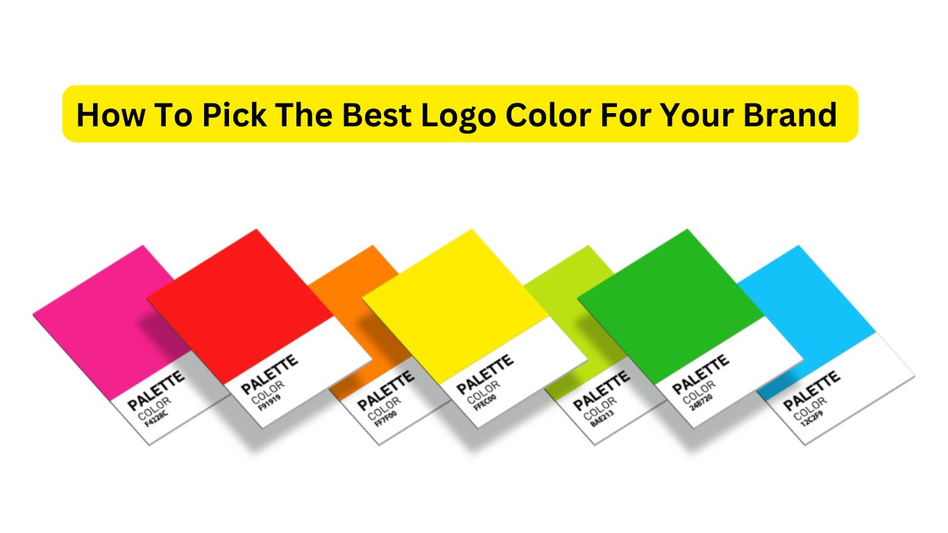
3. Create a Flexible Logo Color Palette
A well-curated logo color palette ensures consistency across various platforms and mediums. Whether you’re designing a full color logo or a simplified version for different contexts, having a balanced palette is essential.
Tips for Building a Color Palette:
- Start with a Primary Color: Choose one main color that defines your brand.
- Select Complementary Colors: Pick secondary and tertiary hues that enhance your primary color.
- Consider Neutrals: Incorporate black, white, or grey to add balance and versatility.
Here’s a quick table summarizing an example palette strategy:
| Element | Purpose | Example Color |
|---|---|---|
| Primary Color | Main brand identity | Blue |
| Secondary Color | Supports and accentuates | Green |
| Tertiary Color | Additional accents | Orange |
| Neutral Base | Balance and readability | Grey |
4. Align With Your Brand Personality and Audience
Your chosen logo color should mirror your brand’s core values and speak directly to your target audience. Consider whether your brand personality is fun, serious, innovative, or classic, and let this guide your color decisions.
- Best colors for logo design: If your brand is innovative and youthful, you might lean towards bold, vibrant colors. Conversely, if you’re aiming for a professional and trustworthy image, cooler shades may work best.
- Color logo design: Think beyond aesthetics—consider how your colors communicate your brand message and differentiate you from competitors.
5. Test and Refine Your Choices
No matter how carefully you plan, testing is essential to ensure your logo color resonates in real-world scenarios. A/B testing and gathering customer feedback can reveal unexpected insights.
Steps for Effective Testing:
- Prototype Variations: Create different versions of your logo with varied color schemes.
- Conduct Surveys: Use online surveys or social media polls to gather opinions on the best colors for a logo design.
- Monitor Engagement: Track metrics such as click-through rates and brand recall after introducing your new logo.
Below is a sample table outlining a testing framework:
| Testing Phase | Action | Metric to Measure |
|---|---|---|
| Prototype Development | Create multiple color variations | Design consistency |
| Audience Feedback | Conduct surveys and focus groups | Customer preference rating |
| Digital Engagement | A/B test on digital platforms | Click-through and engagement |
| Final Adjustments | Refine based on data | Overall brand recognition |
Conclusion
Choosing the right logo color isn’t merely a design decision—it’s a strategic move that can shape your brand’s perception in the market. By understanding the psychology behind colors, analyzing competitors, crafting a versatile logo color palette, aligning with your brand’s personality, and rigorously testing your choices, you’ll be well on your way to selecting the best colors for logo design that truly reflect your brand identity.
Leave a Reply