So, you’re designing a logo. You’ve got the colors picked out, the vibe locked in, and maybe even a rough idea of the design. But then—you hit a wall. What font should you use?
With thousands of fonts out there, it can feel like searching for a needle in a haystack. Pick the wrong one, and your brand could look unprofessional or forgettable. Pick the right one, and your logo instantly communicates your brand’s personality and makes a lasting impression.
Don’t worry—I’ve got you! This guide will walk you through how to choose the perfect logo font without pulling your hair out.
Why Fonts Matter in Logo Design
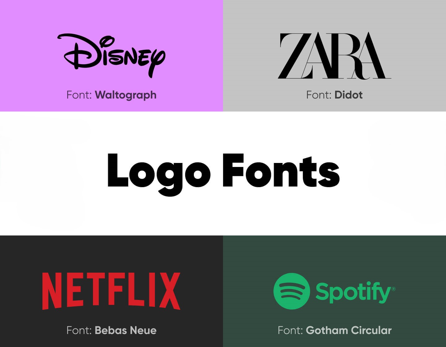
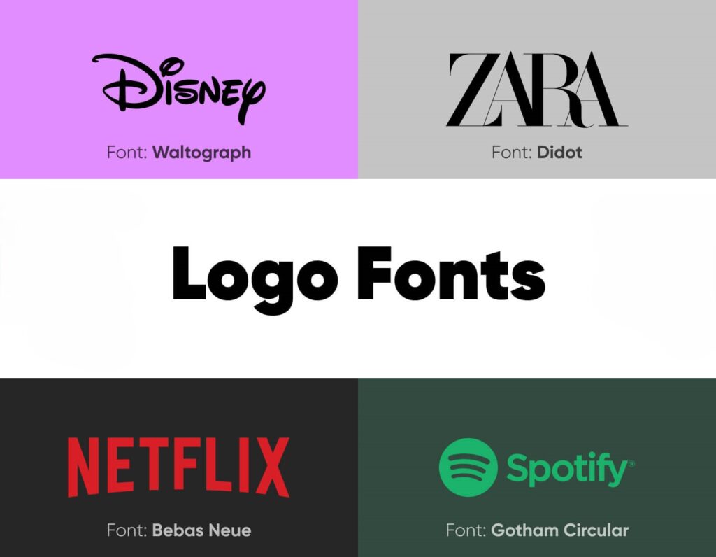
Think about some of the world’s most recognizable brands. Coca-Cola, Google, Nike, Disney—each of these logos has a distinct font that helps shape its identity.
Fonts can make your brand look:
✅ Trustworthy (think classic serif fonts)
✅ Modern and sleek (clean sans-serif fonts)
✅ Fun and playful (quirky script or display fonts)
Simply put: Your font tells a story before you even say a word. So let’s make sure you’re telling the right one.
Step 1: Define Your Brand Personality
Before you even open a font library, ask yourself:
👉 What’s the vibe of my brand? (Formal, casual, modern, vintage?)
👉 Who is my audience? (Tech-savvy professionals? Fun-loving creatives? Parents shopping for kids’ toys?)
👉 How do I want people to feel when they see my logo? (Confident? Excited? Nostalgic?)
Now, match your answers to the font style that fits best:
| Brand Vibe | Best Font Style | Example Brands |
|---|---|---|
| Classic & Trustworthy | Serif (e.g., Times New Roman, Garamond) | Vogue, Rolex |
| Modern & Minimal | Sans-Serif (e.g., Helvetica, Montserrat) | Google, Spotify |
| Elegant & High-End | Script (e.g., Great Vibes, Pacifico) | Cartier, Coca-Cola |
| Bold & Playful | Display (e.g., Bebas Neue, Impact) | Disney, LEGO |
Step 2: Choose the Right Font Category
There are four main font categories, and each one has a different personality:
1. Serif Fonts (For a Classic & Trustworthy Look)

✔️ Best for: Luxury brands, law firms, financial institutions
✔️ Examples: Times New Roman, Garamond, Baskerville
✔️ Brands that use it: Vogue, Rolex, The New York Times
2. Sans-Serif Fonts (For a Clean & Modern Look)

✔️ Best for: Tech companies, startups, lifestyle brands
✔️ Examples: Helvetica, Futura, Montserrat
✔️ Brands that use it: Google, Facebook, Spotify
3. Script Fonts (For an Elegant & Personalized Look)
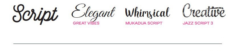
✔️ Best for: Fashion brands, beauty products, creative businesses
✔️ Examples: Pacifico, Great Vibes, Dancing Script
✔️ Brands that use it: Coca-Cola, Instagram, Cartier
4. Display Fonts (For a Unique & Playful Look)

✔️ Best for: Entertainment, kids’ brands, innovative startups
✔️ Examples: Bebas Neue, Impact, Playfair Display
✔️ Brands that use it: Disney, LEGO, Fanta
Step 3: Make Sure It’s Readable (Seriously, This Is Non-Negotiable!)
Even the coolest font in the world is useless if people can’t read it. Before committing, test your font in different sizes, colors, and backgrounds.
✔️ Does it look good in both large and small sizes?
✔️ Is it still legible in black and white?
✔️ Does it work on both digital and print materials?
💡 Pro Tip: Avoid overly decorative fonts for your main text. They might look great on a wedding invitation but can be a nightmare for a logo.
Step 4: Keep It Unique (Avoid Overused Fonts!)
Some fonts are so overused that they instantly make a brand feel generic. Here are a few to think twice about:
| Overused Font | Why to Avoid | Better Alternatives |
|---|---|---|
| Papyrus | Overused in yoga/spiritual brands | Opt for a unique serif or handwritten script |
| Comic Sans | Too informal and unprofessional | Try Poppins or Montserrat for a fun yet clean look |
| Arial | Lacks personality | Consider Lato or Open Sans for a modern twist |
For truly unique branding, consider customizing a font or tweaking an existing one with minor adjustments.
Step 5: Test Different Font Combinations
Sometimes, using two complementary fonts can make your logo stand out. A common trick is to pair a bold font with a simple one.
Winning Font Pairings for Logos
| Primary Font | Secondary Font | Best For |
|---|---|---|
| Playfair Display (Serif) | Montserrat (Sans-Serif) | Luxury & editorial brands |
| Bebas Neue (Display) | Open Sans (Sans-Serif) | Bold & modern businesses |
| Pacifico (Script) | Lato (Sans-Serif) | Creative & lifestyle brands |
Want to experiment? Try Google Fonts for free font pairings.
Step 6: Trust Your Gut (But Get a Second Opinion!)
Once you’ve narrowed down your options, test them out:
✔️ Print your logo on paper. Does it still look good?
✔️ Ask friends or colleagues for feedback. Do they think it matches your brand?
✔️ Mock it up on a website or product. Does it fit the aesthetic?
Final Thoughts: Keep It Simple & Memorable
Picking the perfect font for your logo doesn’t have to be overwhelming. Just follow these key takeaways:
✅ Match your font to your brand’s personality
✅ Choose readability over fancy flourishes
✅ Avoid overused fonts and aim for uniqueness
✅ Test it in different formats and sizes
✅ Pair fonts wisely if using more than one
Now, go forth and create a logo that truly represents your brand!
Leave a Reply